We’ve all been there before. Your edit looks beautiful and the colors, are perfect. That color grade you spent hours meticulously crafting and the shade of yellow you chose for your titles is just right. Everything about your edit is just the way you envisioned. You export, airdrop the file to your iPhone, and… it looks like garbage. That yellow is now a disgusting orange and your color grade has an overpowering teal shift that makes your video look like it was graded using Microsoft paint. Now you have to spend hours “blind coloring” hoping that the changes you are having to make will look decent on your iPhone and… everyone else’s devices. Let’s change that.
What color space and gamma does the iPhone use?
Quick version, since this is probably what you searched for:
- Display color space: Display P3, a wide-gamut space about 25% wider than sRGB. Every iPhone since the iPhone 7 has one.
- Color management: iOS is fully color-managed. It reads the profile baked into each file and shows it correctly, and it treats anything untagged as sRGB. That’s why a P3 photo and an sRGB photo both look right on the same screen.
- Video capture: SDR video records in Rec. 709. HDR video records as Dolby Vision (HLG-based) on the iPhone 12 and up.
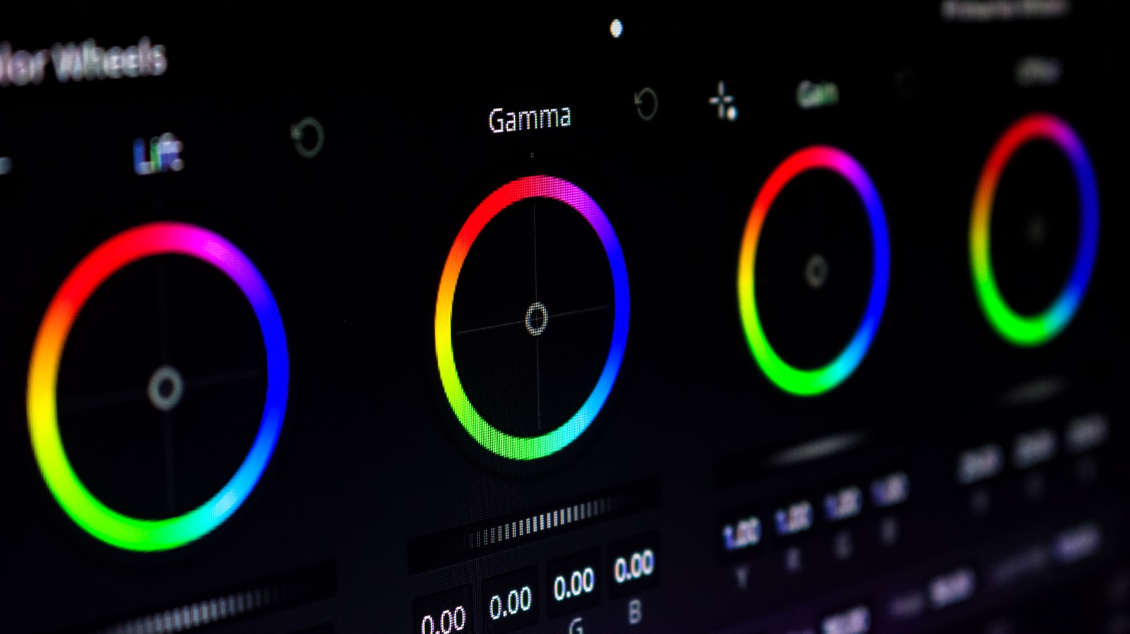
- Gamma: the screen follows the sRGB curve, which lands around gamma 2.2. That’s lighter than the 2.4 you grade to in Rec. 709, and it’s a big reason your export can look off on the phone.
So the real answer to “why does my export look different on my iPhone” is that you’re almost certainly grading on an uncalibrated screen, against a phone that’s color-managed and sitting on a slightly different gamma. The fix is a calibrated, color-accurate monitor. I break down the why below, and my actual monitor picks are further down the page.
Color gamut, monitors, and calibration tools.
To understand why you need to have a color-accurate monitor, you first need to understand color spaces and why they are important. For the sake of this article, I will be covering SDR (standard dynamic range) workflows. HDR (high dynamic range) is extremely complicated, there isn’t a single way of doing things, and HDR requires a lot of special (and expensive) equipment. As amazing as HDR is, it is best left to cinema productions for now. Okay, let’s dive in.
Color Gamut

There are 4 main color gamuts that you will encounter in post-production. sRGB, Rec. 709, DCI-P3, Rec. 2020. No color gamut is better than the other, each color gamut has its own use in production.
sRGB: For graphics
sRGB is the most common color gamut developed primarily for graphics. sRGB isn’t used in video post-production. Because of this, the only thing you need to be aware of is the fact that any content you create will look good on an sRGB display; which is what most modern consumer displays use. Your iPad and iPhone use sRGB for example. Should you grade in sRGB then since that’s what your devices are? Well… no. sRGB does not have defined gamma, brightness, or white point (white balance basically) so you can have 2 displays that are graded to sRGB but look completely different as those other 2 variables are not defined.
Rec. 709: The standard for SDR video
Rec. 709 is the standard for all SDR video productions. Rec. 709 displays the same amount of colors as sRGB yet it has a defined gamma of 2.4 (BT.1886), a peak luminance (brightness) of 100 nits, and a D65 white point.
Let’s talk about the white point. The standard in film is 6500k (D65), however, almost all displays are set to a cooler white point of D55 or even D50. Why? Well because most consumers like cooler-looking colors and they sell better in Best-Buy (I wish I was kidding). So should you edit in D50-55 then? No. Just say your screen is calibrated to D55, you export, then watch the video on a D55 TV screen. Your video will look way cooler than it was when you edited it. The reason behind this is that your TV is incapable of understanding your initial white point and will instead apply its own “color correction” to your video, therefore, making your video much cooler. Your D55 video is now a D45 video; that completely unacceptable. Before I continue, let me clarify. It is impossible to make your footage look the same on every device. There are way too many variables on the consumer end. What we can do however is use a white point that will essentially make your footage not be altered to extremes by consumer TVs. D65 is the most natural color temperature of pure white light as determined by complex mathematical equations. Therefore, D65 is the only white point you should edit on and will transform to an acceptable limit on all consumer devices.
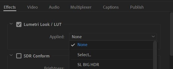
What about the gamma. Gamma is, in simplest terms, contrast. When Rec. 709 was being developed, color scientists assumed that most people would be watching content on their TVs in a dark living room. Therefore they proposed that all video content should have a gamma of 2.4 which results in deeper blacks and a punchier image. This was all fine and dandy until streaming services like YouTube came along. YouTube (and the web in general ) have a standard gamma of 1.96 (less contrast) as dictated by sRGB IEC standards. When editing in Premier, you have a gamma of 2.4 (as determined by Rec. 709) therefore when you export and upload to YouTube, your colors will look washed out as your video is essentially being converted to a gamma of 1.96. How do you fix this? An export LUT! This LUT will need to be applied to your export in the export dialogue and NOT directly on your footage. This LUT will essentially shift your gamma to 2.6 so that when your video is on YouTube it will appear to have the correct gamma of 2.4 and look the exact way it does in Premiere Pro. You can download the LUT here.
DCI-P3: For HDR cinema projectors
P3 is something you might have seen touted by many Apple products. However, what Apple is referring to is only the color gamut “P3” and not the “DCI” component. Just like Rec. 709, DCI specifies the gamma (2.6), luma (1000 nits), and white point (D65) necessary for reproduction on digital cinema projectors (what you would encounter in a movie theater). A DCI-P3 calibrated display does not look good at all as it cannot be accurately reproduced due to shifting color primaries. It needs to be projected.
Back to the “P3” part. P3 simply means that it has 25% more colors than sRGB/Rec.709. All Apple is saying when they tout their P3 displays is that there will be less banding between similar shades as opposed to an sRGB display and therefore more natural (and vivid) color reproduction.
Rec. 2020: For HDR digital displays
Rec. 2020 is still very new and can display an insane amount of colors compared to Rec.709 as it uses 12-bit color processing as opposed to the 8-bit of Rec.709. This results in billions of more colors. However, there is not a single consumer display that can display the full spectrum of Rec. 2020. Because of this, Rec. 2020 is used as a “container” for other color spaces like P3 and then is paired with an HDR gamma like HLG (Hybrid Log-Gamma) to accurately display the P3 color space on a consumer 4k HDR screen.
I know, my brain hurts too. The TL;DR is that you should always edit in Rec. 709, with a gamma of 2.4, and a white point of 6500k (D65) so that your content can be displayed the best on multiple displays and have the least amount of color shifting issues. Now, don’t go looking around Premier for these settings or change your Mac’s display profile. In order to accomplish our goal, you must have the right tools.
The best monitors for editing and color grading
Having an accurate monitor is an absolute necessity for creating beautiful color grades. Not only will your videos look stellar but your speed and efficiency will greatly increase as you will no longer have to export and then re-grade your color based on what you are looking at on your iPhone. When I began my career in post-production I would routinely have to adjust my color to the average of all my devices I had. I would export, view my video on my iPad and Mac Book, make small adjustments, re-export, then repeat until I got the video to a good place. It was a massive time waster. Now, I can edit, color, then export with zero worry about whether my color is accurate since I now have a color-accurate screen.
The Low-Tier Solution: ASUS ProArt
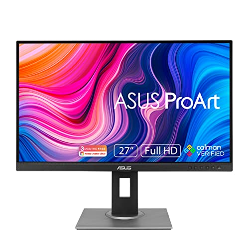
Finding the best monitor for color grading when you have a small budget is a hard task, though, not impossible. My recommendation is the ASUS ProArt PA278QV. This is an absolutely wonderful monitor and has all the specs you would want and need for accurate color grading. And for around $250, there isn’t a better monitor money can buy at this price point. Asus makes some of the best panels in the business and the ProArt range is no exception. This monitor is made specifically for industries that require accurate color reproduction… like video creation!
The Mid-Tier Solution: BenQ PD2725U
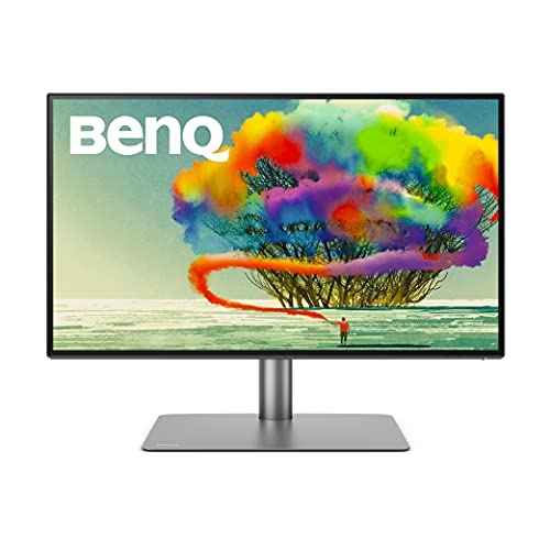
Though primarily made for designers and graphic artists, this monitor by BenQ can be accurately calibrated to Rec. 709 with no issue. Last time I calibrated this monitor I was able to get it to match a $5000 Sony broadcast OLED almost perfectly. Many colorists in LA I know use this as their monitor for their DaVinci Resolve software and pair it with a dedicated reference monitor. If you want to see what that full setup looks like, I break it all down in my guide to building a proper color suite. And the best part is… it’s only $949. Yeah, I know, that’s still an investment but it is 100% worth it and you will not find a better monitor at this price.
The high-end solution: SmallHD OLED 27″ vs. Apple Studio Display XDR
Now we’re in the big leagues. This is the standard for reference monitors. I LOVE this guy. To get the absolute best color grading, this monitor is a necessity and is a borderline “industry standard.” I usually hate referring to certain items as “industry-standard” but I have never been to a post facility or film set where they didn’t have one of these. Once properly calibrated, the amazing contrast of the OLED panel and the color range this monitor can reproduce is staggering. You truly have to see it to believe it.
One catch worth knowing: SmallHD has since discontinued the OLED 27, and its successor (the Quantum line) runs well into five figures and sells through dealers, not Amazon. Unless you score a used one, treat this as the dream you’re building toward, not the thing you buy this week. For a color-accurate display you can actually buy today without a dealer account, read on.
There are slightly cheaper alternatives to SmallHD. FSI makes a comparable monitor (FSI DM240) but unfortunately, I would highly advise against buying anything from FSI. Back when I worked at my old studio, we had constant issues with FSI products. They were impossible to calibrate, had terrible panel uniformity, would randomly turn off when in use, and the monitors would make audible noise. The worst of which was their $14,000 XM651U which would not even turn on half the time. Granted, this was over 4 years ago so perhaps their quality control has improved. However, until they send me a monitor to review and show me that their QC has drastically improved. I cannot recommend FSI.
If you own a Mac Pro or Mac Studio, take a hard look at the Apple Studio Display XDR. Apple discontinued the old Pro Display XDR in early 2026 and replaced it with this, and at $3,299 it actually lands about $1,700 under the outgoing model. It almost replaces the need for a dedicated reference display. The colorists I know here in LA who ran the old XDR swore by it, and this is the natural successor. Best part: it’s the rare high-end, color-accurate display you can order today and have on your desk this week.

Accessories: Calibration tools and video outputs

Having an accurate monitor is only the first step in getting proper color. You must invest in a high-quality calibration tool like the Calibrite Display Pro HL. In my opinion, this is the best tool for PC monitors. It replaced the older ColorChecker Display Plus, and for an SDR grading monitor it’s plenty. Only step up to the pricier Display Plus HL if you’re calibrating an HDR mini-LED or OLED panel. For calibrating broadcast reference monitors or other cinema displays, you need to hire a professional. If you are based in SoCal, the folks at Avical are the absolute best, extremely professional, and know their craft better than anyone.
If you intend to use your monitor as a reference monitor (meaning it will only display the video and nothing else), it is a requirement to buy a clean video output connector. Plugging in your monitor directly to your computer (Mac or PC) is not a good idea as the operating system will apply its color profile to your image. Additionally, most graphics cards only support an 8-bit output meaning you are not able to get the most from your monitor. To circumvent this buy either a PCI-e or Thunderbolt dedicated HDMI/SDI output. SDI is always the best choice but if your monitor does not have SDI, a clean HDMI output will suffice.
For PC (or MacPros): Blackmagic Design DeckLink Mini Monitor 4K
For Macs: Blackmagic Design UltraStudio Monitor 3G (Thunderbolt 3, and still HD/SD only, so no 4K unfortunately)
In Conclusion
That was a lot. I know. But I hope I gave you the information you need to succeed and make the best purchase using your hard-earned money. Color is by far one of the more complicated sectors of post-production so don’t fret if you don’t understand everything. You will eventually. If you have a question, leave a comment below!